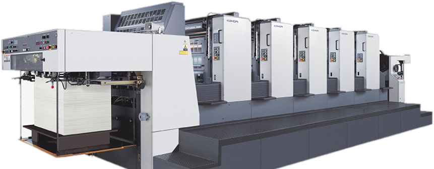
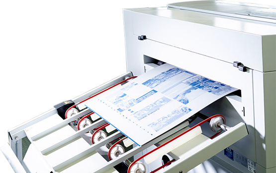
Frequently Asked Questions


Scrollbar: normal or longer?

RGB vs. CMYK - Which colour setting should I use?

RGB (Red, Green, and Blue) colour is the colour on your monitor, NOT the colour used for printing.

To make any image suitable for printing it MUST be first converted to CMYK (Cyan, Magenta, Yellow, and blacK) colour.

The reason for this is because RGB colour is based on radiant light i.e. light coming from a light source and hitting your eyes; while CMYK colour is based on reflected light, i.e. light coming from an RGB source (such as the sun or a ceiling light), and reflecting off a surface and having certain frequencies cancelled out, producing CMYK colour.

Printers must use CMYK inks (and hence CMYK files) so that they can get the printed piece to reflect the right kind of RGB light which then hits your eyes to let you see the right colours.

Pantone (or "spot") Colours - What are they?

Pantone colours are specialised ink colours not used in CMYK printing.

They can be selected on your machine if you have the proper palettes installed, but you cannot use them on the same page as a CMYK image (unless you want to pay extra printing fees...).

Essentially pantone colours are used when you want a colour image, but only need one or two colours and do not want to have the expense and effort of making a four colour piece. They can also be used to accent greyscale projects at little additional cost.

Pantone colours should never be printed at the same screen angle as black. If you are using the pantone colour in a duotone or as a screen overprinting black, the two colours dot pattern will print in the exact same area, producing an effect that is remarkably similar to mud.

Photoshop and Image file formats - Which one should I use?

Image file formats come in as many styles as there are image-processing programs. And if you are on a PC the options can be truly nightmarish, (.pcx, .gif, .tif, .jpg, .bmp). However, for the purposes of printing, it comes down to acceptable formats for output. Any images you send to us must be in either .jpg or .bmp format.

Anything else has a very remote chance of being output correctly, and we may refuse the file, OR, convert it to something that IS usable and then charge you for the service.

NOTE: No images from the web are EVER suitable for printing, all images on the web are either RGB colour or Indexed colour, both unacceptable and are ALWAYS of very poor resolution (i.e. 72 dpi - optimal dpi for printing is 300 dpi).

Output file formats - What formats are acceptable?

There are three standard programs for layout and printing in the design and prepress world. These are; Corel Draw, Adobe InDesign and QuarkXpress.

Any file you make should use one of these three major programs in order to be properly output. If you do not have one of these three programs, then there are options. Most bureaus will accept foreign files (i.e. Files coming from programs that are not one of the "big three") that have been converted to either postscript or EPS (.eps) formats.

What this means is that instead of giving the file "as is" to us we must first print it to a downloadable file that can then be dumped directly into the outside bureau's image setters.

For more information on how to make .eps files, please see your program manual.

Other notes - Word processing programs are not, and will not be, suitable for final output. They do not provide cropping or registration marks, and cannot handle colour separation at all. Do not even try it!

Supplying Fonts with Your job - Should I include the fonts I have used?

All fonts used in your document MUST accompany that document when it is submitted to Coburg Printworks.

Most prepress houses will have an extensive library of fonts, but they may not be the same as the fonts YOU use, or they may be of a slightly different format from the ones you use, and as such will cause reflow of your text; not a good thing. In addition, while some fonts are very popular right now (such as Mason, Remedy, Exocet, and Abaddon) there is a better than average chance that your prepress house will NOT have them.

Not having the right fonts handy, or not having them supplied by YOU is a job-stopper that will ALWAYS be charged to you. So do not do it, include all the fonts always.

Postscripts vs. Truetype Fonts - Which font should I use?

There is only one thing you need to know when considering postscript fonts vs. truetype fonts, and that is...DO NOT USE TRUETYPE FONTS!

Postscript fonts have a special part of them that is designed to be read by image setters and high end printers that tells the image setter and/or printer EXACTLY how the font is supposed to look.

Truetype fonts on the other hand are designed to be printed on screens and laser printers, not image setters. Hence with a postscript font you ALWAYS know what is coming out when you print it.

PC Fonts - Which font should I use?

Same as Postscript vs. Truetype fonts above but even more so. Truetype fonts on the PC have the annoying habit of converting themselves to other fonts at the drop of a hat.

If you MUST use Truetype fonts in your PC document then make sure that when you are done with the file you either have all the Truetype fonts converted to outlines or know the EXACT postscript equivalent and are willing to sit through several proofs before the final output.